Color is more than just a visual element; it’s a powerful communication tool that can influence perceptions, evoke emotions, and even drive actions. Understanding what different colors mean and how they are perceived can help brands craft a visual identity that resonates with their audience. In this blog post, we’ll explore the meanings, representations, and appropriate uses of the main colors in branding across various industries.
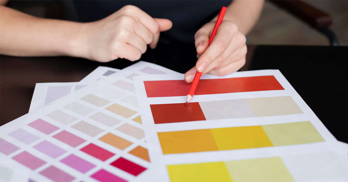
Red: Passion, Energy, and Urgency
What It Represents:
Red is a color that exudes energy, passion, and action. It’s often associated with excitement, love, and urgency, making it a compelling choice for brands that want to create a sense of urgency or stimulate excitement.
When to Use It:
Red is ideal for industries that revolve around action, passion, or excitement, such as entertainment, sports, food and beverage, and fashion. It’s also commonly used in marketing materials to grab attention and drive action, such as in clearance sales or calls to action.
Brand Persona:
If your brand persona is bold, daring, and energetic, red can be a perfect match. It reflects a brand that is unafraid to stand out and make a statement.
Industries:
- Entertainment: Red is often used in the entertainment industry to evoke excitement and drama.
- Food and Beverage: Many fast-food chains use red to stimulate appetite and convey a sense of urgency.
- Sports: Red is frequently used by sports brands to communicate energy and passion.
Blue: Trust, Reliability, and Calmness
What It Represents:
Blue is synonymous with trust, reliability, and calmness. It’s a color that is often associated with the sea and sky, evoking feelings of stability and tranquility.
When to Use It:
Blue is an excellent choice for industries that need to convey trust and dependability, such as finance, healthcare, and technology. It’s also a color that can soothe and reassure, making it suitable for brands that want to create a calm and professional atmosphere.
Brand Persona:
Brands with a persona that is dependable, professional, and trustworthy often choose blue. It reflects a brand that values long-term relationships and stability.
Industries:
- Finance: Blue is widely used in the finance industry to convey trust and stability.
- Healthcare: Many healthcare brands use blue to evoke a sense of calm and trustworthiness.
- Technology: Tech companies often use blue to communicate reliability and innovation.
Green: Growth, Health, and Freshness
What It Represents:
Green is closely associated with nature, growth, and health. It’s a color that symbolizes renewal, harmony, and the environment, making it a popular choice for brands that want to emphasize sustainability and wellness.
When to Use It:
Green is suitable for industries focused on health, wellness, and sustainability, such as organic products, eco-friendly brands, and healthcare. It’s also a great choice for brands that want to convey growth and vitality.
Brand Persona:
If your brand is eco-conscious, health-oriented, and committed to growth, green is an ideal color. It reflects a brand that is in tune with nature and values sustainability.
Industries:
- Healthcare and Wellness: Green is commonly used in health and wellness industries to promote freshness and health.
- Environmental and Sustainable Brands: Green is the go-to color for brands focused on sustainability and environmental responsibility.
- Food and Beverage: Organic and natural food brands often use green to signify freshness and health.
Yellow: Optimism, Happiness, and Creativity
What It Represents:
Yellow is the color of sunshine, symbolizing optimism, happiness, and creativity. It’s a bright and cheerful color that can lift spirits and inspire positive emotions.
When to Use It:
Yellow is great for brands that want to convey a sense of fun, creativity, and positivity. It’s often used in industries like entertainment, children’s products, and creative services.
Brand Persona:
Brands with a playful, creative, and optimistic persona often gravitate towards yellow. It’s a color that reflects a brand that is cheerful, friendly, and full of energy.
Industries:
- Entertainment: Yellow is used in the entertainment industry to convey fun and joy.
- Children’s Products: Brands targeting children often use yellow to attract attention and evoke happiness.
- Creative Services: Yellow is popular in creative industries to symbolize innovation and imagination.
Purple: Luxury, Creativity, and Mystery
What It Represents:
Purple is a color that has long been associated with royalty, luxury, and creativity. It’s a color that can evoke a sense of mystery and sophistication, making it a popular choice for premium brands.
When to Use It:
Purple is ideal for industries that want to convey luxury, creativity, or a sense of exclusivity. It’s often used in beauty, fashion, and luxury goods.
Brand Persona:
If your brand persona is creative, sophisticated, and premium, purple is a fitting choice. It reflects a brand that values quality and creativity.
Industries:
- Luxury Goods: Purple is commonly used in the luxury industry to evoke a sense of exclusivity and high-end appeal.
- Beauty and Fashion: Many beauty and fashion brands use purple to communicate creativity and luxury.
- Creative Services: Purple is also used in industries focused on creativity and innovation.
Black: Elegance, Power, and Sophistication
What It Represents:
Black is a color that exudes elegance, power, and sophistication. It’s often associated with formality, authority, and timelessness, making it a versatile choice for a range of industries.
When to Use It:
Black is ideal for industries that want to convey sophistication, exclusivity, and authority. It’s often used in fashion, luxury goods, and corporate branding.
Brand Persona:
Brands with a persona that is elegant, authoritative, and timeless often choose black. It reflects a brand that values sophistication and power.
Industries:
- Fashion: Black is a staple in the fashion industry, symbolizing elegance and sophistication.
- Luxury Goods: High-end brands often use black to convey exclusivity and premium quality.
- Corporate Branding: Black is used in corporate branding to communicate professionalism and authority.
White: Simplicity, Purity, and Clarity
What It Represents:
White is a color that represents simplicity, purity, and clarity. It’s often associated with cleanliness and minimalism, making it a popular choice for brands that want to convey simplicity and transparency.
When to Use It:
White is suitable for industries that value simplicity, purity, and transparency. It’s often used in healthcare, technology, and modern design.
Brand Persona:
Brands with a persona that is clean, modern, and transparent often gravitate towards white. It reflects a brand that values simplicity and clarity.
Industries:
- Healthcare: White is widely used in healthcare to convey cleanliness and purity.
- Technology: Many tech companies use white to symbolize simplicity and innovation.
- Design: White is popular in design industries to create a clean and modern aesthetic.
Choosing the right color for your brand is more than just a design decision; it’s a strategic choice that can influence how your audience perceives you. By understanding the meanings and representations of different colors, you can align your brand’s visual identity with its core values and connect more deeply with your target audience. Whether your brand is bold and energetic or calm and trustworthy, there’s a color that can help you communicate your message effectively.